I am quite pleased with my final result, but I have a few criticisms. The first of which is there are a few rough edges on the coral, and a few on the plane. If I'd had time I would have worked to improve that. I like the way the light falls on the coral, I think that's realistic. I also like the blue of the background, it gives the picture a good depth of field. I also like the silhouettes of the fish against the light blue of the background.
I decided to create this image after my ideas generation as it appealed to me.I chose the used image of the plane rather than the other one in my research as I felt it would give a better impression of having been on the sea-floor for many years. The temple image I used as it was already ruined and had interesting textures and background.
I took my source images from the internet as they were readily available. However, I could also have scanned in images from books or gone to the aquarium and taken my own pictures.
James Kitcher
Tuesday, 28 September 2010
Final outcome
For my final outcome I had to do a underwater scene. Below are some screenshots of my progress.
First, I used the photo of the Greek temple to provide a background, and used the pen tool to remove the sky.I used hue saturation and colour balance layers to change the colour to deep blue. I used free transform to rotate the background. Next I used photos of coral reefs to add in the fore-ground.
First, I used the photo of the Greek temple to provide a background, and used the pen tool to remove the sky.I used hue saturation and colour balance layers to change the colour to deep blue. I used free transform to rotate the background. Next I used photos of coral reefs to add in the fore-ground.
After feathering the edges of the coral I added the plane wreck, and more reef in the back to give the picture depth. The feathering removed the hard edges and artefacts from the original source photo.
For this one I used the gradient tool to add the impression of water and I used the noise distortion to add little dots to give the impression of plankton. I feel the plankton adds realism to the image.
For the final step I added beams of light using the polygon lasso tool, added white and feathered the edges and altered the opacity. I also brought the blue gradient forward a few layers and added fish. I like that the light is shining on the bright parts of the aeroplane.
Wednesday, 22 September 2010
Type fonts
Today we discussed type fonts and how to use them. We talked about the different styles of fonts, these include serif (with 'tails'), sans serif (no tails) and script (similar to handwriting).
To do this I went into the window tab in photoshop and selected character which brought up a small task box where I could adjust the text according to my liking. To add the text I created a new layer and I went to the typing tool and clicked in the middle of the picture and added the type I required. Using the character window I could change the colour of the text, the size and the font. I could also adjust the spacing of the writing as demonstrated above.
We discussed how colour, composition, spacing and type font affect the image and are able to draw your attention to a poster, a magazine or similar.
I chose that particular font and colour of font as I felt it would fit in well with the image. I believe I was correct.
Tuesday, 21 September 2010
Leopardoscerous
For this picture I used two pictures and combined them one into the other, just like the lizard and the hippo, but this time I used the 'liquify' tool. While using this tool I moulded the picture of the leopard to fit the shape of the rhino. Next I used a mask layer to remove the superfluous parts of the leopard image. I also used the clone stamp to clean the texture up.
Here is the finished image below.
Here is the finished image below.
I'm happy with this image, apart from the remnants of the leopard's tail and feet.
Original image:
My proposal
My idea is to have a plane wreck, old ruins, a remotely operated vehicle (ROV) and a blue whale. In my picture I will use a ruined ancient Greek temple and place it underwater then I will use an old aeroplane wreck and I’m going to make it look as if the plane has crashed in front of the ruined temple many years ago. I'm planning to use a remotely operated vehicle or ROV to investigate the ruins and the plane crash.
In behind the ruins and the submarine I'm planning to include a blue whale far away in the ocean in the background to just swim around. I’m also going to add some minor details such as seaweed, lighting and bubbles to add more life and detail. The temple and the plane will be sitting on rocks to add depth and interest to the final image.
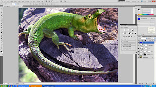
Hungry, Hungry Hippozid
Today in Photoshop we were combining a lizard with a hippo, this is how we did it;
First I used an image of a hippo from MOODLE, and one of a lizard. I shrunk the image of the hippo to line it up with the lizard's head.
Next I used an adjustment layer to alter the colour of the hippo to make it match with the lizard. I used a hue/saturation layer.
Afterwards I used another adjustment layer, this time it was a colour correction layer to adjust the lighting so it matches the photograph of the lizard.
With the colour correction layer selected I used a mask layer to get rid of tyhe green inside the hippo's mouth, eye and ear to reveal the flesh colour.
Then I used the clone stamp tool to cover over the lizard's nose with the texture of the tree trunk to make it authentic.
 Finally I used the fill tool to cover the entire picture with a blue colour and then set it on overlay mode and lowered the opacity to 30% to give the image a blue tint.
And here is the final piece.
First I used an image of a hippo from MOODLE, and one of a lizard. I shrunk the image of the hippo to line it up with the lizard's head.
Next I used an adjustment layer to alter the colour of the hippo to make it match with the lizard. I used a hue/saturation layer.
Afterwards I used another adjustment layer, this time it was a colour correction layer to adjust the lighting so it matches the photograph of the lizard.
With the colour correction layer selected I used a mask layer to get rid of tyhe green inside the hippo's mouth, eye and ear to reveal the flesh colour.
Then I used the clone stamp tool to cover over the lizard's nose with the texture of the tree trunk to make it authentic.

And here is the final piece.
I am happy with the final image, I especially like how I've blended the head onto the neck in a realistic manner.
Here is one of the source images.
Monday, 20 September 2010
Copyright issues
All the work you produce yourself is entirely your own, unless it features somebody else, in which case you need them to sign a release form.
If you want to use someone else's work you can either: write to the copyright owner to ask their permission to use their work, or you can use work in the public domain, but not until after 70 years when it becomes available for the public. If you are unsure whether the content in question is safe to use without legal recourse you can use copyright free websites, eg, sxc.hu or copyleft.
If you want to use someone else's work you can either: write to the copyright owner to ask their permission to use their work, or you can use work in the public domain, but not until after 70 years when it becomes available for the public. If you are unsure whether the content in question is safe to use without legal recourse you can use copyright free websites, eg, sxc.hu or copyleft.
Subscribe to:
Comments (Atom)


